Time-lapse Star Rotation Effect Using CSS Animation

Landscape is the default theme of Hexo 2.4+. I really like the background picture of the header. And I think it will be cool if the stars can rotate slowly in the sky. With CSS animation we can easily implement this idea:

First we need to process the photos. Our goal is to get a clean backgound without stars, a picture of stars with transparent background and a solid image as a mask.

Three Layers

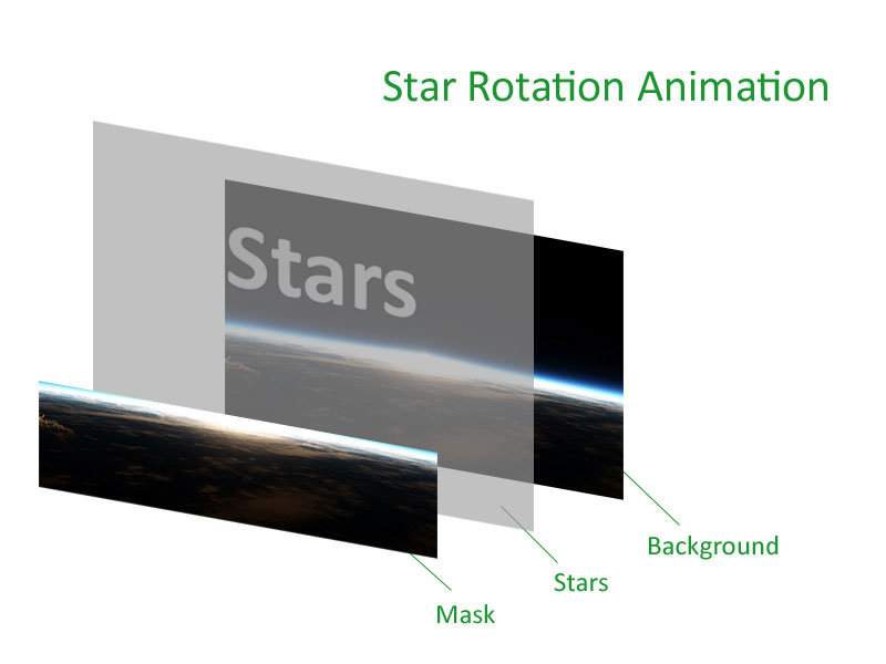
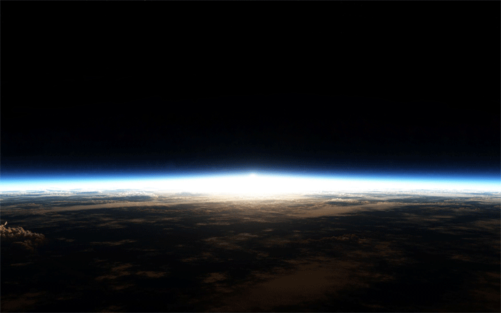
1. To get the background, erase all the stars with the Spot Healing Brush and Clone Stamp tool in Photoshop.

Erase Stars

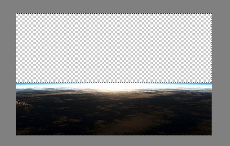
2. The mask is easy, just selete and delete the dark area of the background.

Mask

3. The stars are hard to extract. You can try the Magic Wand or Background Eraser tool. And we need to copy the stars several times to get a bigger image so even when it is spinning, the stars can still show up on the background (The size depends on where the center of the rotation is).

4. Setting up CSS and adjust the animation parameters.

HTML
1
2
3
4
5
<div id='stars-bg' >
<div id='stars-mask'></div>
<div id='stars' style="">
</div>
</div>
CSS
1
2
3
4
5
6
7
8
9
10
11
12
13
14
15
16
17
18
19
20
21
22
23
24
25
26
27
28
29
30
31
32
33
34
35
36
37
38
39
40
41
42
43
44
45
46
47
48
49
50
51
52
53
54
55
56
57
58
59
60
61
62
63
64
65
66
67
68
69
70
71
72
73
74
75
76
77
78
79
80
81
82
83
84
85
86
87
88
89
90
91
92
93
#stars-bg {
overflow: hidden;
position:relative;
width: 800px;
height: 300px;
background: #000 url(/images/newplanet-2.jpg) center;
background-size: cover;
z-index: 1;
}
#stars-mask {
position: absolute;
width:100%;
height:100%;
background: url(/images/newplanet.png) center;
background-size: cover;
z-index: 3;
}
#stars {
top: -800px;
left: -300px;
position:absolute;
width: 1545px;
height: 1545px;
background: url(/images/stars.gif);
z-index: 2;
animation: spin 300s infinite linear;
-webkit-animation: spin 300s infinite linear;
-moz-animation: spin 300s infinite linear;
-ms-animation: spin 300s infinite linear;
-webkit-transform-origin: 772px 772px;
-moz-transform-origin: 772px 772px;
-ms-transform-origin: 772px 772px;
transform-origin: 772px 772px;
background-size: contain;
-webkit-background-size: contain;
-moz-background-size: contain;
}
@-moz-keyframes spin {
0% {
-webkit-transform: rotateZ(0deg);
-moz-transform: rotateZ(0deg);
-ms-transform: rotateZ(0deg);
transform: rotateZ(0deg);
}
100% {
-webkit-transform: rotateZ(360deg);
-moz-transform: rotateZ(360deg);
-ms-transform: rotateZ(360deg);
transform: rotateZ(360deg);
}
}
@-webkit-keyframes spin {
0% {
-webkit-transform: rotateZ(0deg);
-moz-transform: rotateZ(0deg);
-ms-transform: rotateZ(0deg);
transform: rotateZ(0deg);
}
100% {
-webkit-transform: rotateZ(360deg);
-moz-transform: rotateZ(360deg);
-ms-transform: rotateZ(360deg);
transform: rotateZ(360deg);
}
}
@-o-keyframes spin {
0% {
-webkit-transform: rotateZ(0deg);
-moz-transform: rotateZ(0deg);
-ms-transform: rotateZ(0deg);
transform: rotateZ(0deg);
}
100% {
-webkit-transform: rotateZ(360deg);
-moz-transform: rotateZ(360deg);
-ms-transform: rotateZ(360deg);
transform: rotateZ(360deg);
}
}
@keyframes spin {
0% {
-webkit-transform: rotateZ(0deg);
-moz-transform: rotateZ(0deg);
-ms-transform: rotateZ(0deg);
transform: rotateZ(0deg);
}
100% {
-webkit-transform: rotateZ(360deg);
-moz-transform: rotateZ(360deg);
-ms-transform: rotateZ(360deg);
transform: rotateZ(360deg);
}
}

The idea in this article is inspired by Joe Howard’s Animating Images With CSS Keyframes. He shows a step-by-step example and the article is really worth reading.

I create a Hexo theme with this. If you are interested, you can download it here. Demo.

^